for the game

Basketball Blueprint
Digital Experience
Nike
4 days. That was how long we had to concept a tool for Nike’s website that would educate and connect consumers to the right basketball shoes. Our muse was a 17 year old kid. So, we had speak to our audience in language they understood. We had to make it useful. And if we wanted them to actually use it, we had to make it fun.
Years ago, I took the Meyers Briggs test. And for some reason, it came up again around that time, sparking the idea of player archetypes. The theory was that by asking a few simple questions, we could map kids to a style of play. That archetype would align to a group of athletes from Nike’s roster, along with a curated collection of shoes.
The project turned out to be one of my most collaborative professional experiences. We worked side-by-side with the team at Nike every step of the way, from concept to research, to prototyping and user testing, to design and messaging, to development and backend integration with Nike’s tech team.
And the best part was that it worked. Nike’s analytics showed extremely high engagement, completion, and conversion. That set us up to refresh the evergreen experience every season with new players and products.

Breaking down the product.
Before we could design archetypes, we had to analyze the assortment and create intuitive product groups. Our user research indicated that kids thought about shoes in simpler terms than how Nike typically communicates. What kids understood best was shoe height (high, mid, low) and the amount of cushioning. So, we built a matrix to group products along those lines.
Creating the archetypes.
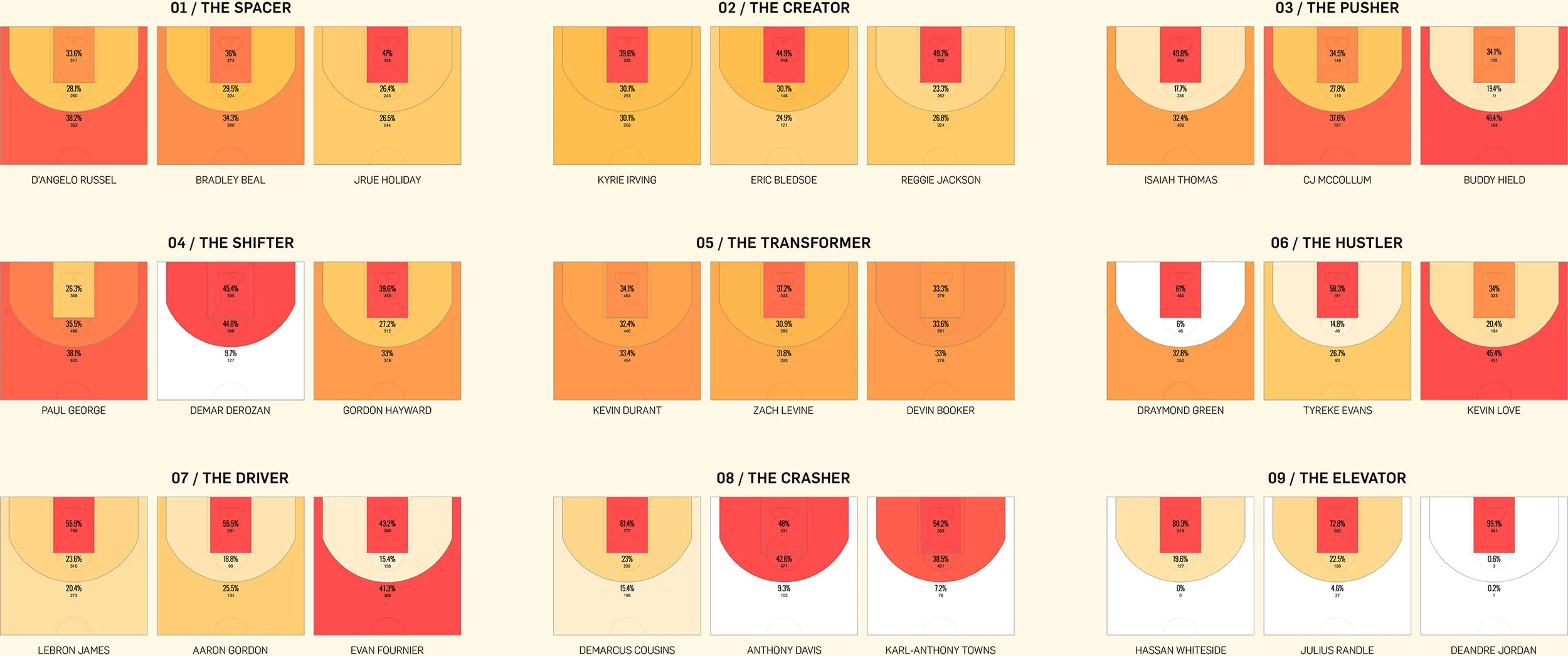
Nike’s products are actually designed for different types of movement. And movement correlates to areas of the court. In our research, we found that shot frequency was a pretty good proxy for where players spend most of their time on the court. Then we analyzed Nike’s entire roster and crossed that with their style of play to create archetypes.
Making the prototype.
To make the whole experience fun and engaging, we knew we needed to push the UX. That meant incorporating a lot of imagery and animation and creating a way for kids to actually interact with the court. Building clickable motion prototypes allowed us to develop a proof of concept and test our theories before moving into design.

Exploring the design.
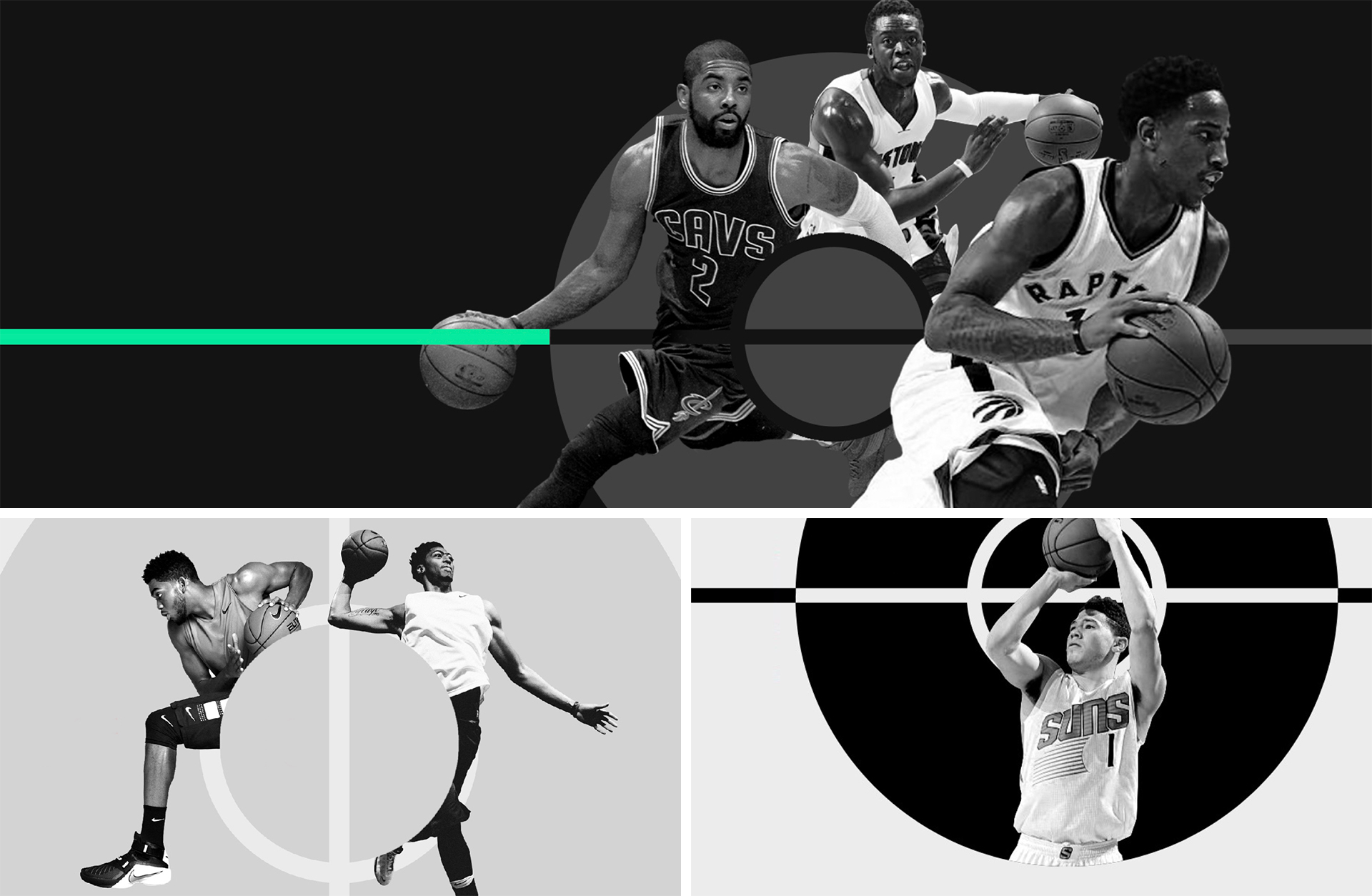
Nike didn’t have assets for every player on their roster. And we knew there wasn’t enough time or budget to shoot every player. Plus, we needed a way to update the experience over time in a smart and efficient way. That meant sourcing imagery from the NBA and creating a unified aesthetic. Then, we brought that design to life with animation in code.
Direction 02
Direction 01
Direction 03
Final Design Direction
Writing the code.
The trickiest part was translating the entire concept into development. That meant turning our algorithm and design into a fully functional, responsive web app that could be embedded in Nike’s enterprise CMS. But each territory had a different assortment. So, the products also had to be dynamic and tie into Nike’s e-commerce database. And every page had to be localized in more than 20 languages.


